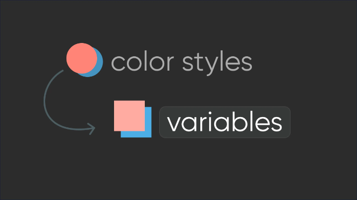
Enhance your Figma design system in just 15 minutes by incorporating colour variables
June 22, 2024
Published by Jamie Wallace
Enhance your Figma design system in just 15 minutes by incorporating colour variables
Figma has recently unveiled highly anticipated variables, heralding the need to migrate existing UI kits and design systems to this new framework. This article serves as a detailed guide for seamlessly incorporating variables into your existing colour styles without the arduous task of updating all components and layouts. Thanks to the magic of plugins, this process can be executed swiftly and effortlessly.
1. Defining Your Starting Point
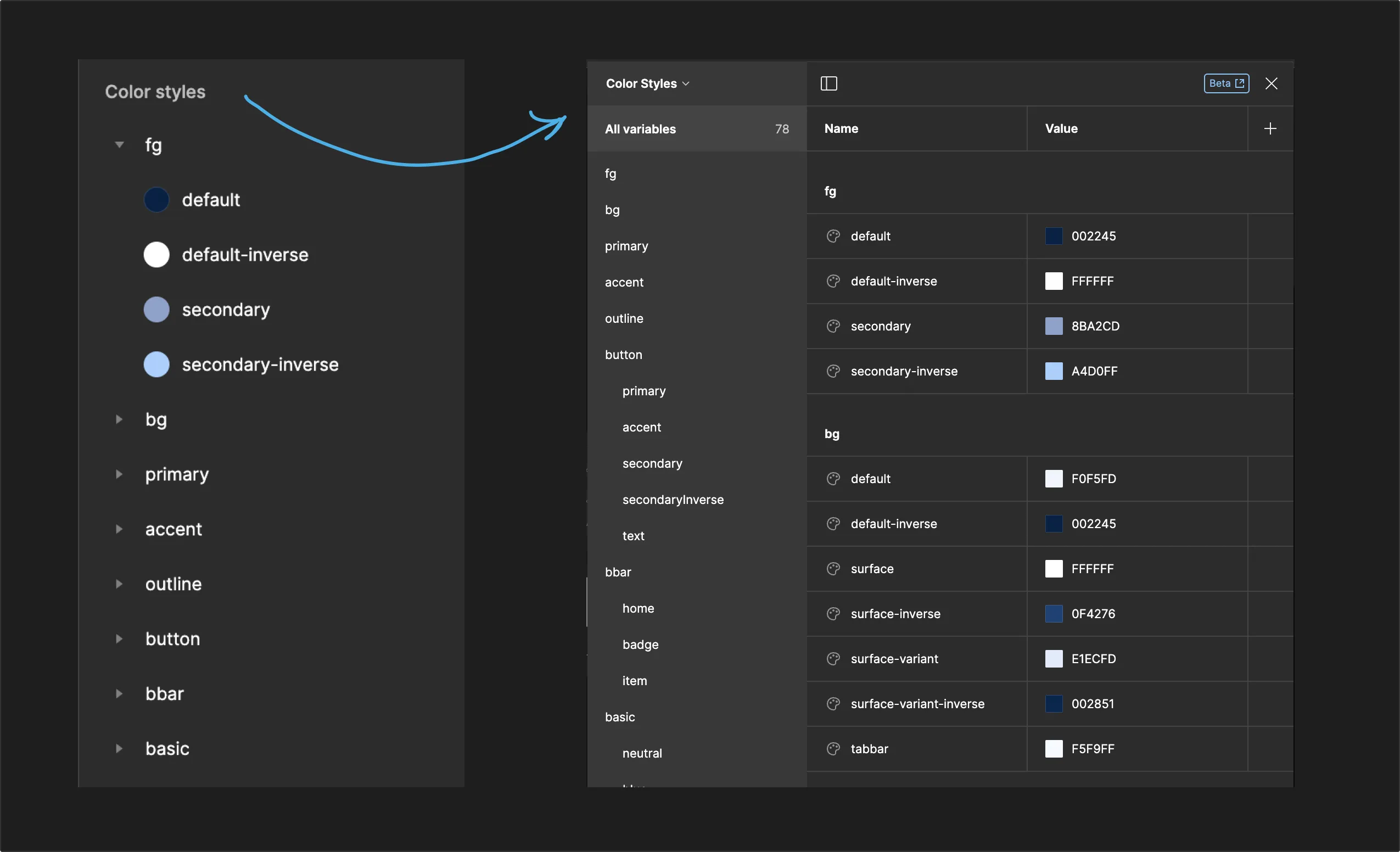
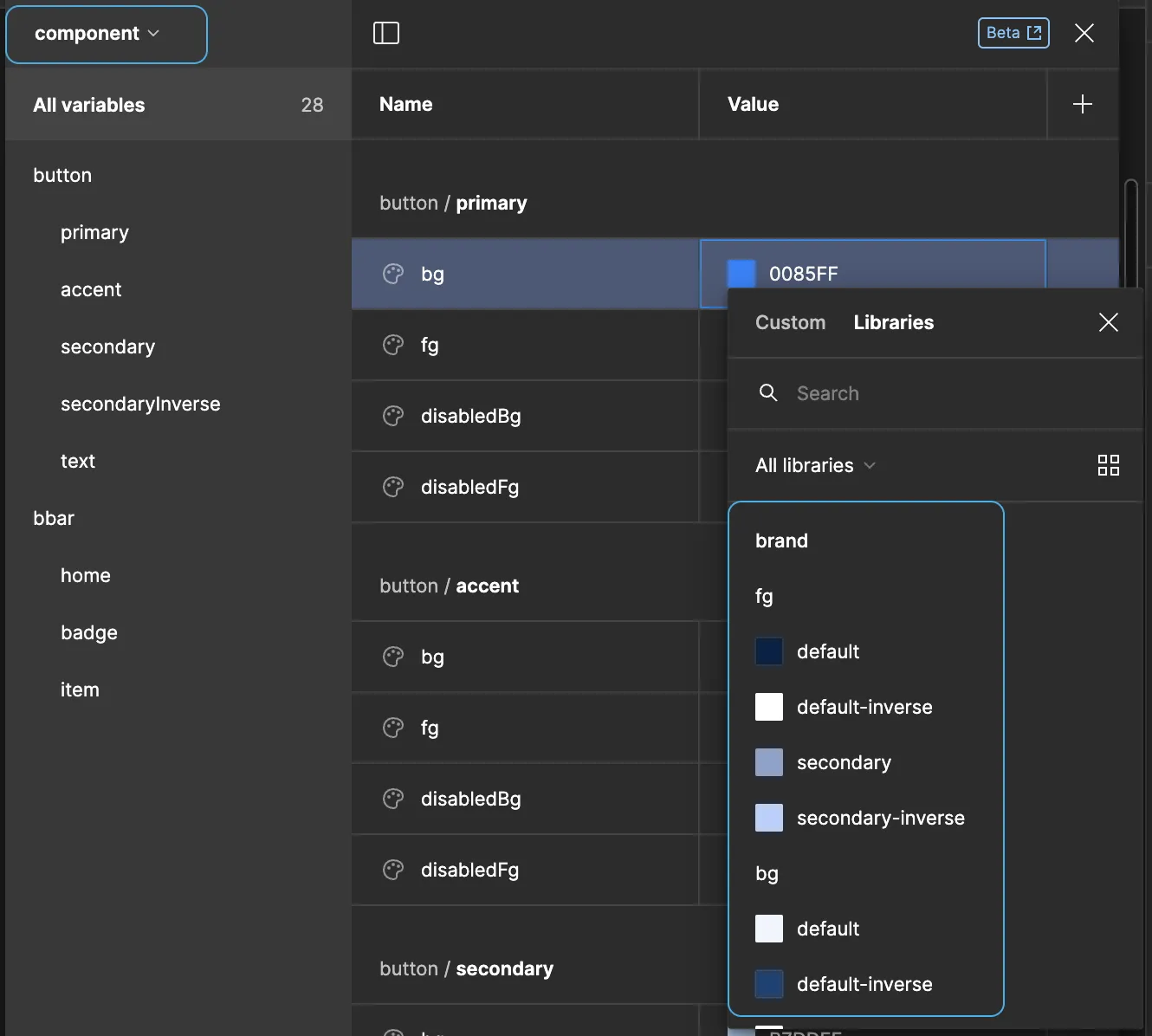
Begin by examining the pre-existing colour styles within your library. On one side, you'll find the complete list of colour styles as they exist in Figma, while the main image illustrates their functionality within the design system and code. These styles encompass fundamental colours, the brand palette (primary, foreground, background, etc.), and various styles linked to components like buttons and navigation bars. The primary palette derives from the basic colours, and the component colours rely on the palette.
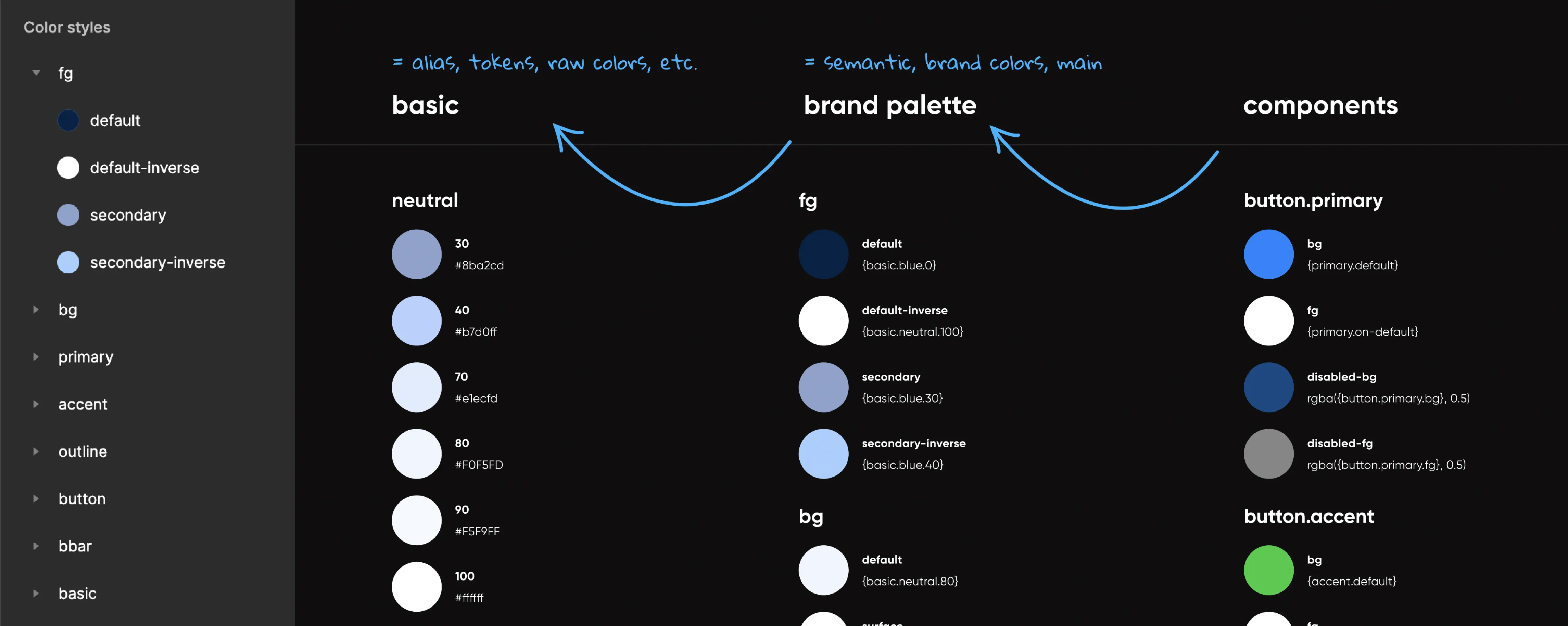
Figma's variables facilitate the creation of connections between these colours, offering the advantage of automatic updates when fundamental colours change. With a simple click, you can effortlessly switch between light and dark modes. This ensures that your design system operates harmoniously with its code counterpart. The variables are conveniently located here:
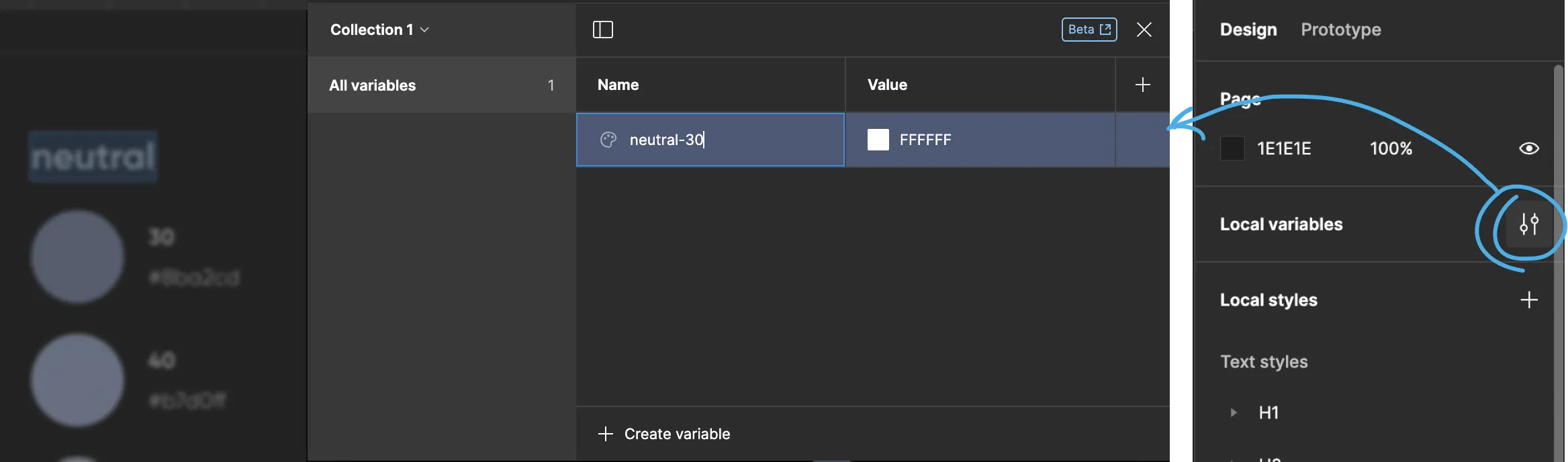
Of course, the variables aren't pre-filled, but manual creation isn't the preferred option.
2. Leveraging Plugins
To transition all styles to variables, we recommend using the Styles to Variables Converter plugin (kudos to Marcin Ukleja). Other plugins are likely available for handling JSON files with colours, depending on your needs.
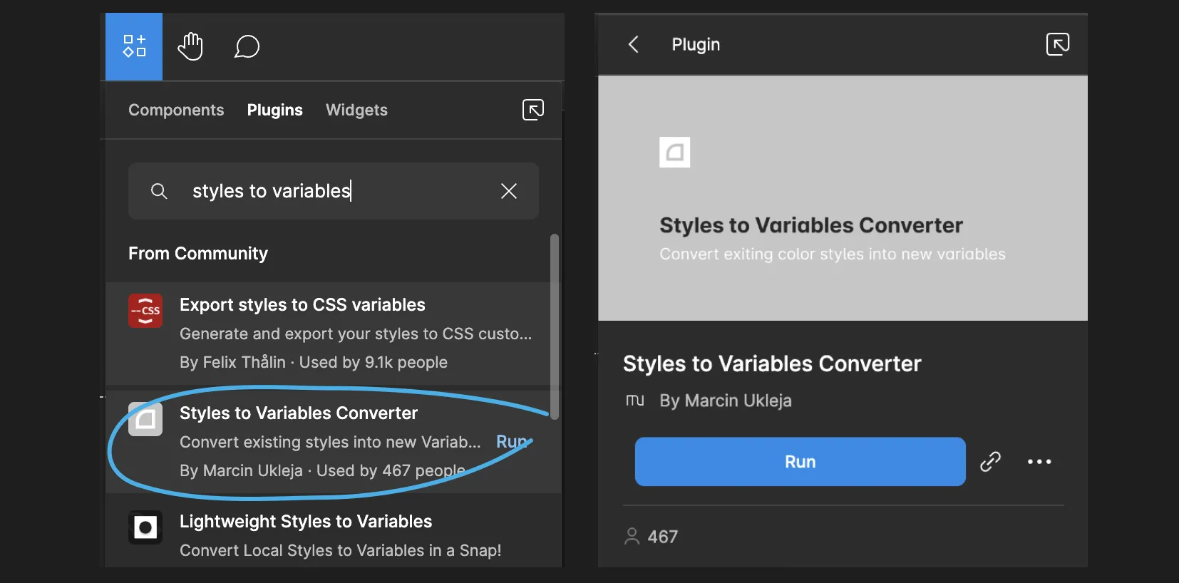
Clicking the "Run" button within the plugin swiftly generates a "Color Styles" collection in the Variables window.
3. Creating and Customizing Collections
Suppose you want to categorize your colours into three collections: basics, palette, and components, aligning with your design system. To accomplish this, use the "Run" button in the plugin two more times to create these colour style sets, then rename them accordingly. Remove any redundant colour groups from each collection:
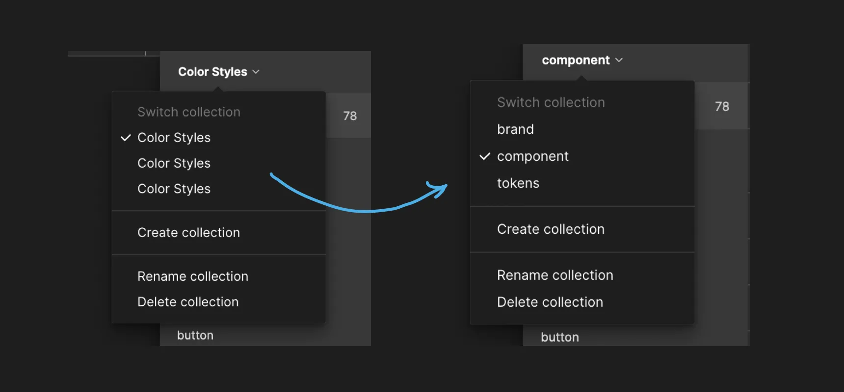
- In the "tokens" collection, retain only the basic colours and eliminate other extraneous colour groups.
- In the "brand" collection, preserve relevant colour groups from the brand palette while discarding the rest.
- For the "component" collection, maintain only the colours relevant to components and widgets. Creating separate colour variables for components is unnecessary unless explicitly needed.
For those whose basic colours are unorganized, the TokenMaster plugin is a handy tool to group your colour scheme based on the colours in use. These colours will serve as your basic tokens. Create a collection called "tokens" and add these colours to it.
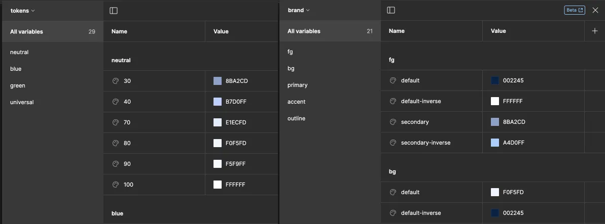
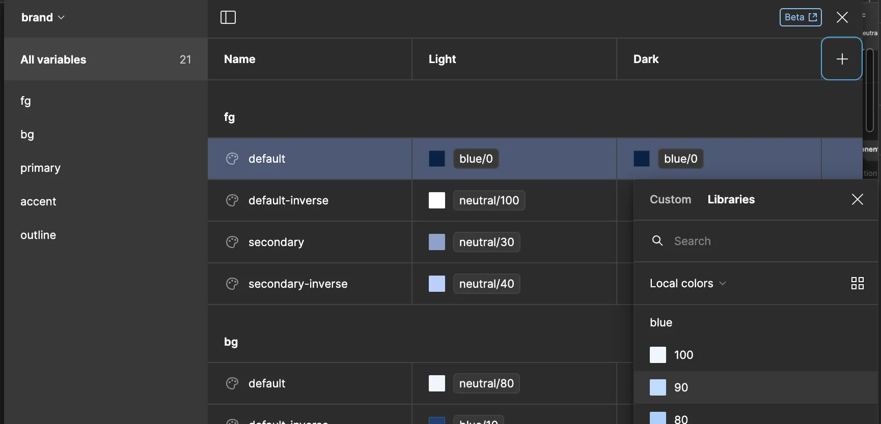
4. Establishing Variable Connections
In the "brand" collection, modify variable values by selecting the desired variable from the "tokens" collection in the Libraries.
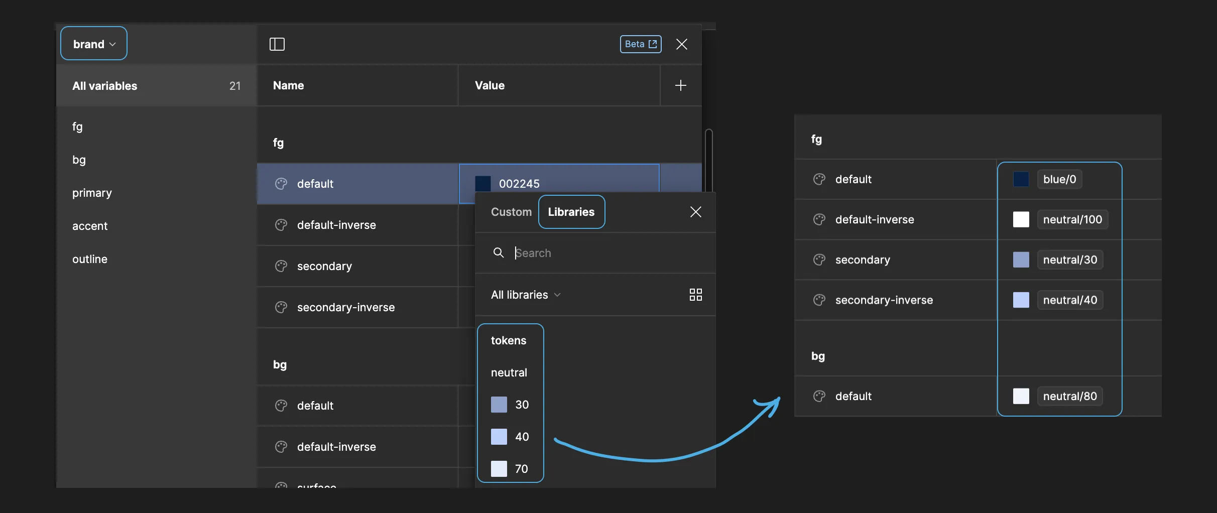
Repeat this process for the "component" collection, referencing variables from the "brand" collection.
5. Introducing Dark Mode
To enable theme switching, add a new variable mode to the "brand" collection. Rename existing modes to "Light" and "Dark," or add more modes for multiple themes. Then, reassign the colours to the corresponding tokens.
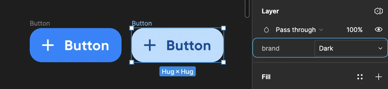
In the interface, theme switching can be achieved with a single click.
Theme switching in the interface becomes a breeze with a single click.
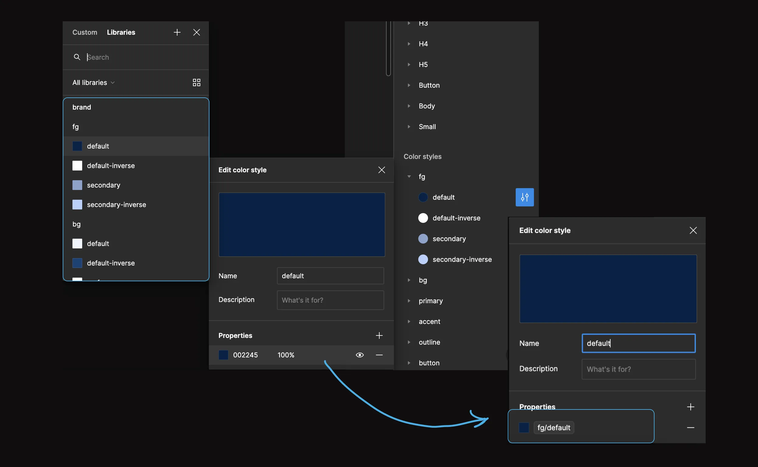
6. Applying Variables to Styles
Congratulations! You've now set up variables and can implement them in your existing styles. Visit the style you wish to edit, and within the style editor, choose the desired variable instead of a hex value. For example, for the "fg-default" style, select the corresponding variable from the "brand" collection. Apply variables to all relevant styles, except for gradients. This ensures that changes to the variables will automatically propagate throughout your styles, offering an efficient method for centralized design system management and updates.
If you decide to solely employ variables, the Destroyer plugin can be used to reset colour styles to their corresponding variables. Select the components, and click "Run - Destroy Color Styles."
7. Publishing Your Library
If you prefer not to have variables clutter the colour picker panel and potentially confuse designers in other Figma files, you can opt not to publish them. In the publishing window, check the "Hide when publishing" option for variables.
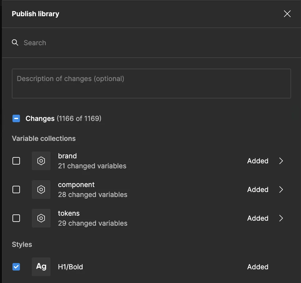
For libraries utilizing only variables, it's advisable to publish the collections, but it's prudent to hide the collection of basic tokens to prevent accidental use in layouts.
I trust that this guide has been helpful 😊. If you have any more questions, don't hesitate to ask. Thank you for reading!
Registered Office: Bright HR Limited, The Peninsula, Victoria Place, Manchester, M4 4FB. Registered in England and Wales No: 9283467. Tel: 0844 892 3928. I Copyright © 2024 BrightHR