Designing for thumbs. Why optimising for thumb usability matters in mobile UX
May 16, 2025
Published by Karolina Sarnowska
Designing for thumbs. Why optimising for thumb usability matters in mobile UX
A small insight with a big impact - thumb navigation
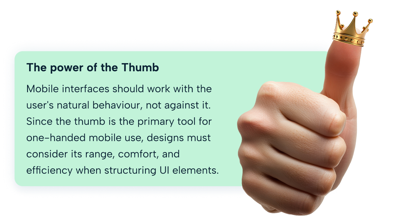
Have you ever thought about how you use your thumb when navigating your phone? Most people assume they tap and scroll using the centre of their thumb - but is this actually the case?
Let’s test this with a quick experiment. Open you favorite mobile app and start scrolling and tapping as you normally would. Now, observe your thumb…Where do you think it’s making a contact with the screen? If you guessed the centre - take closer look. Studies show that in reality the side of the thumb does most of the work.
This small insight has significant implications on mobile design. Understanding the natural thumb movements help UX designers create interfaces that feel more intuitive, improving accessibility and usability for everyone.
Next time you reach for your phone, pay attention to how your thumb interacts with the screen. What do you notice? And more importantly, how this knowledge could shape a future of mobile experiences.
Why thumbs matter in mobile UX?
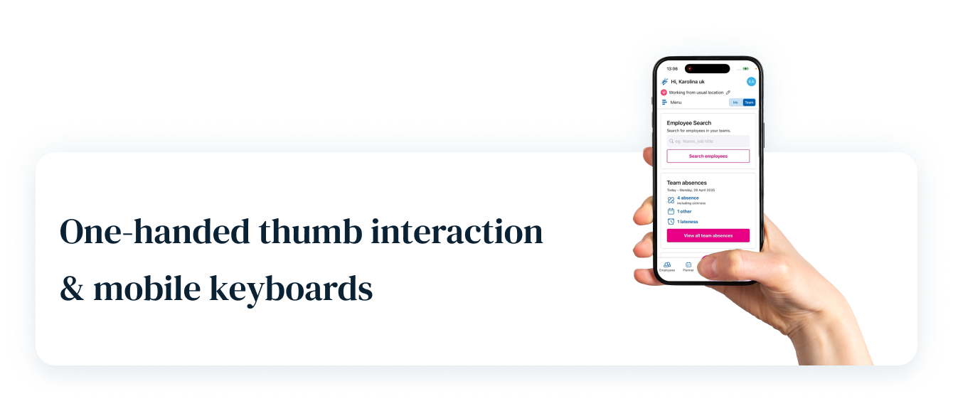
1. Thumbs drive most mobile interactions
Most users navigate their smartphones using their thumb as the primary touch tool, making thumb-friendly UI design essential for intuitive and effortless interaction.
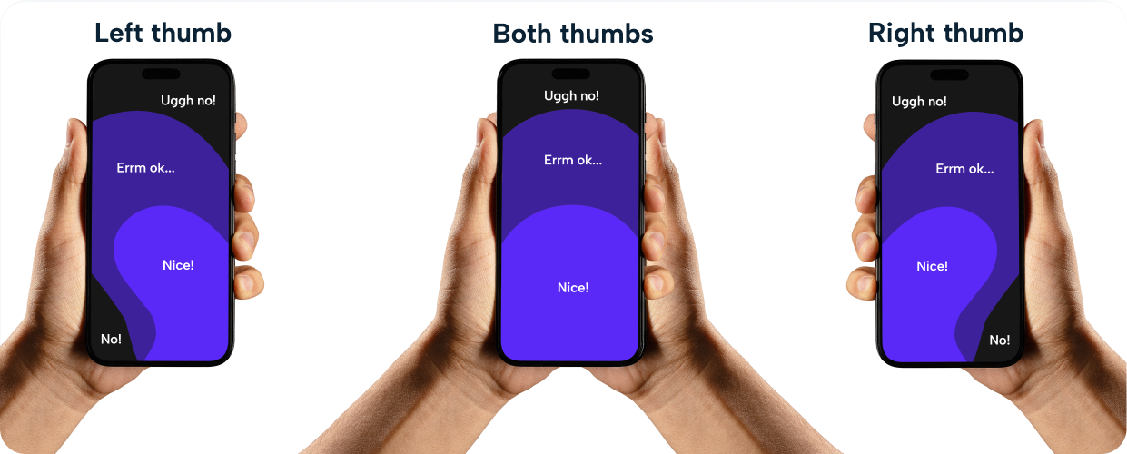
2. Most users (49%) interacts one handed here
With mobile devices being one-hand dominant, designs must accommodate easy reachability, ensuring key elements are placed within natural thumb zones.
3. Bad thumb design leads to frustration
Misplaced buttons, tiny touch targets, and awkward gestures cause user fatigue, interaction errors, and lower engagement, impacting the overall usability of an app.
The science of thumb friendly design and the thumb reachability concept
1. Thumbs dictate usability. Interfaces should cater to natural hand movement.
Mobile users rely on their thumbs for navigation, making intuitive placement of UI elements crucial. Interfaces should align with natural thumb movement to ensure effortless interaction.
2. Ignoring thumb ergonomics leads to frustration and inefficiency.
Poorly designed layouts force users into awkward stretches or repetitive motions, leading to discomfort, slower navigation, and lower engagement with an app or website. Thumbs have different anatomy to other fingers too. One less joint means it is more difficult to reach outwards from the screen than towards it.
3. A well-placed UI reduces effort and improves speed.
Placing key actions within easy reach minimises strain, speeds up interaction, and enhances overall user satisfaction, allowing for a smoother mobile experience.
Did you know?
A study examined keyboard size, button shape, and spacing for thumb usability. Results showed that larger keyboards improve accuracy and reduce task completion time.
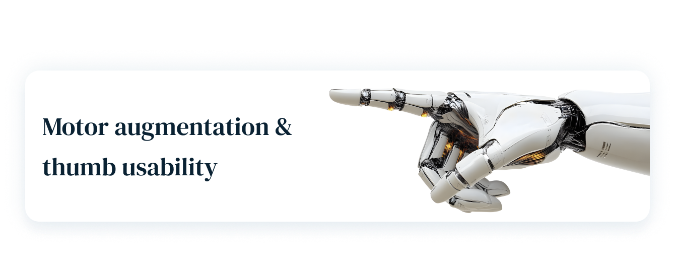
Researchers at Cambridge University explored how users adapt to an extra robotic thumb for enhanced grip and usability. Results indicate that people quickly learn to use additional thumb-like extensions, suggesting potential applications in mobile ergonomics.
Research indicates that edges of screens are harder to tap accurately. Users struggle with precise touch targeting at screen boundaries, affecting usability confidence.
Common mistakes
Misplaced key actions
Users struggle with buttons in hard-to-reach spots.
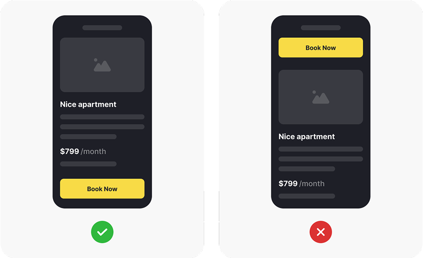
Mistakes:
- Primary buttons placed at the top corners → Forces users to stretch their thumbs, causing discomfort.
- Navigation menus positioned too high → Users struggle to reach key actions quickly.
- Floating action buttons placed far from thumb-friendly zones → Leads to awkward hand movements.
Solutions:
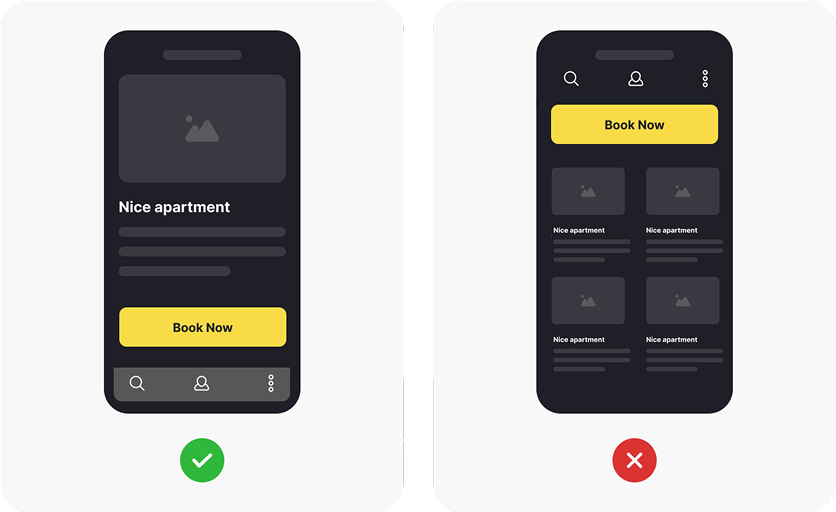
- Bottom navigation bar with key actions → Ensures easy thumb access.
- Larger touch targets within reach → Improves accuracy and usability.
- Floating action buttons placed in thumb-friendly zones → Reduces strain and improves efficiency.
Tiny touch targets
Small UI elements lead to mistaps and frustration.
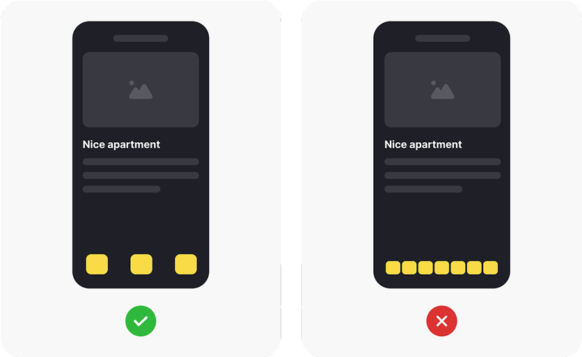
Mistakes:
- Buttons too small to tap accurately → Users struggle to hit the right target, leading to frustration.
- Closely packed UI elements → Increases the chance of accidental taps.
- Minimal spacing between touch targets → Makes navigation difficult and error-prone.
- Tiny icons with no padding → Hard to distinguish and interact with.
Solutions:
- Larger touch targets (at least 44-48px) → Improves accuracy and usability.
- Adequate spacing between elements → Reduces mistaps and enhances navigation.
- Well-padded buttons and icons → Ensures comfortable interaction.
- Thumb-friendly UI layouts → Prioritises ease of use and accessibility.
Ignoring thumb fatigue
Overuse of top navigation and awkward gestures strains users.
Mistakes:
- Top navigation requires constant stretching → Users experience discomfort and strain over time.
- Excessive reliance on swipe gestures → Forces repetitive motions, leading to thumb fatigue.
- Overcrowded UI with too many actions → Users struggle to quickly access key features.
- Lack of adaptive layouts → Forces users into unnatural hand positions.
Solutions:
- Bottom navigation bar for easy access → Reduces thumb stretching and improves comfort.
- Optimised swipe gestures → Ensures natural movement without excessive repetition.
- Minimalist UI design → Reduces cognitive load and enhances efficiency.
- Adaptive layouts based on hand positioning → Allows comfortable interaction across devices.
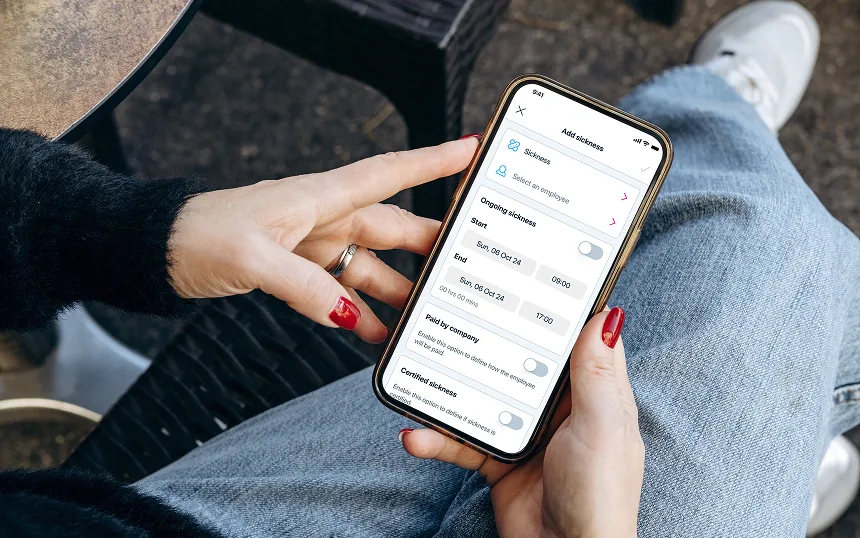
Why good UX matters in HR SaaS platform?
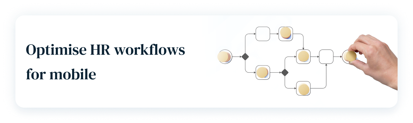
A seamless mobile experience ensures HR teams can approve requests, track payroll, and manage employees anytime, anywhere without frustration.
Mobile HR platforms should prioritise easy-reach actions, swipe gestures, and adaptive layouts to enhance efficiency on small screens.

Employees expect fast, effortless mobile interactions and a well-designed HR app boosts engagement by making tasks simple, intuitive, and frustration-free.
Why Mobile Screen Sizes Matter for Thumb Reach and Usability
20 years ago the technology highlight was to make a mobile phone as small as possible - nowadays as smartphones evolve, one of the noticeable changes has been the increase in screen size.
While this offers a better viewing experience it also impacts how users hold their devices and how far their thumbs can reach. This can lead to frustration or awkward grip adjustments making the use of the device harder and less comfortable.
UX designers and mobile developers need to ensure that usability remains a priority whether by focusing on adaptive interfaces, ergonomic hand gestures or by simply balancing the screen size and their designs.
Next time you use your mobile - pay attention on how you use it. Using your thumb? Notice how far you can reach comfortably, or which part of the thumb is making a contact with your device - and if you think it is a middle of your thumb - you are not the only one. But, in reality it is an edge of your thumb doing all the work. This small insight helps designers create more intuitive mobile experiences.
Resources:
- https://www.uxmatters.com/mt/archives/2013/02/how-do-users-really-hold-mobile-devices.php
- https://www.sciencedaily.com/releases/2024/05/240529142939.htm
- https://www.cam.ac.uk/stories/third-thumb
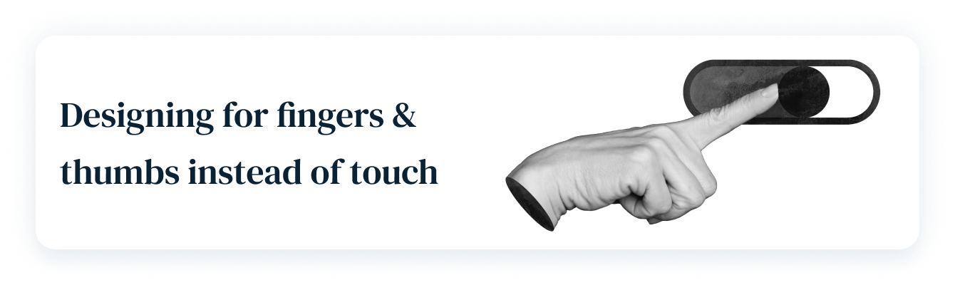
- https://www.uxmatters.com/mt/archives/2013/11/design-for-fingers-and-thumbs-instead-of-touch.php
- https://leadadvisors.com/blog/7-bad-ux-design-examples-you-must-avoid/
- https://www.creativecorner.studio/blog/bad-ux-vs-good-ux
- https://m3.material.io/foundations/designing/structure
- https://developer.apple.com/design/human-interface-guidelines/
- https://www.w3.org/WAI/WCAG21/Understanding/target-size
- https://www.uxmatters.com/mt/archives/2017/03/design-for-fingers-touch-and-people-part-1.php
- https://beebom.com/ios-10-vs-ios-9-comparison/#:~:text=The%20notification%20center%20has%20been,kind%20of.
- https://techcrunch.com/2016/05/11/instagrams-big-redesign-goes-live-with-a-colorful-new-icon-black-and-white-app-and-more/
- https://www.theverge.com/2016/5/11/11656252/instagram-redesigns-icon-app
Registered Office: Bright HR Limited, The Peninsula, Victoria Place, Manchester, M4 4FB. Registered in England and Wales No: 9283467. Tel: 0844 892 3928. I Copyright © 2024 BrightHR